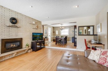
- A view from one brown room to another.
When we bought our house, almost every room was painted a shade of brown. The kitchen was painted gray and one bedroom was light blue, but EVERYTHING else on the first floor was brown. That had to change.
One of the first rooms we tackled was the dining room. I came across Really Teal by Sherwin-Williams and instantly fell in love. Since the room is open to the living room and has light coming in from a window and door to the porch, I felt we could afford to go dark and bold without the room feeling closed off.
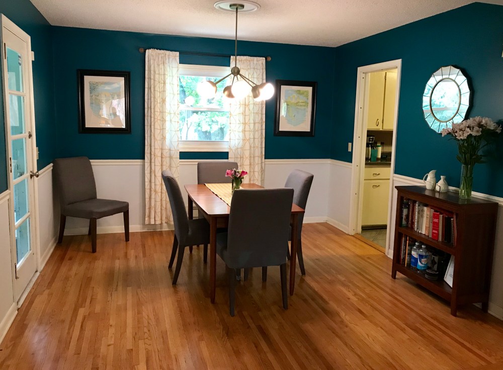
- The after of the dining room with Really Teal and Rock Candy.
This color is also great because it’s historically accurate. California Paints has a 20th Century color selector with info about the origin of their colors. Their teal came from a 1957 wallpaper, but teal was easily found in home interiors and exterior trim from the 1940s to 1960s. This paint collection is a great resource.
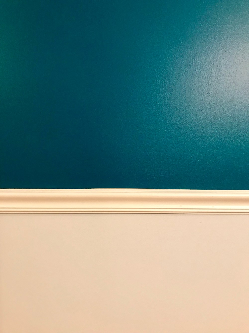
 Since the chair rail was already there, I also wanted to add some variety and pick a different color for the bottom half of the wall. It’s Rock Candy, also by Sherwin-Williams. I like the subtle gray tone to it.
Overall, I think the colors work really well together and just happen to perfectly highlight the existing art we had. We’ve talked about painting the trim throughout the house a cleaner white. But for now, it’ll stay as is.
What do you think of the color choice?
- This color combination was the starting point for other paint choices in adjoining rooms.
Like the light fixture in the dining room? Check out this post about finding the perfect one to replace an oiled bronze monster.

One thought on “The Right Color”