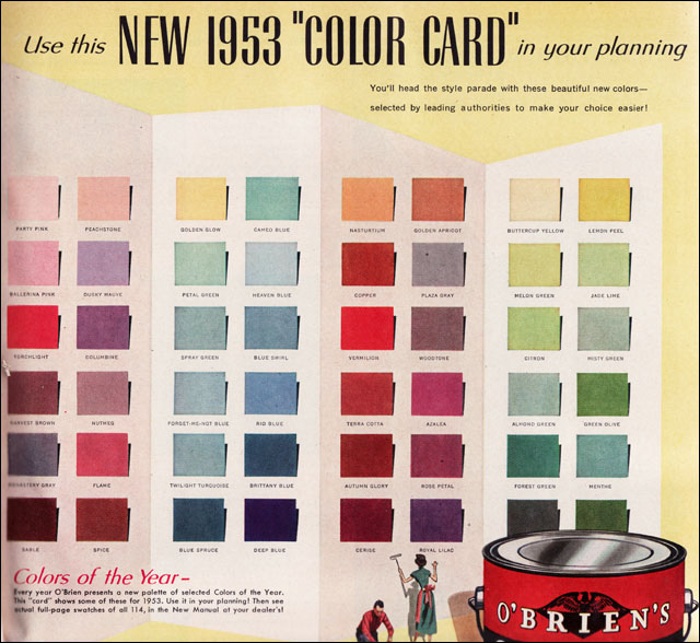
Home decorating and design in the 1950s and ’60s capitalized on color. Warm and bright blues, pinks, and yellows perked up interiors. Meanwhile, deep orange, red, and green exteriors helped homes blend in with their natural surroundings. People weren’t afraid of color.
Then came the ’80s and ’90s. Neutrals became popular, and beige was soon splashed from floor to ceiling. And while we’ve moved on, seeing a resurgence of Mid-Century design and style, many still seem to be scared of color.


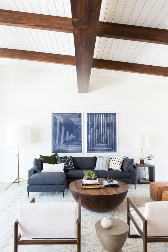
The photos above were found though a search of “mid century modern living room” on Pinterest. While the furnishings and accent pieces may be MCM, the color pallet is definitely not.
A quick search on Instagram or Pinterest reveals fabulous MCM furnishings that appear to be on display in museum-like settings. Stark white walls, ceilings, and even rugs and upholstery do little to show off or pay homage to the sleek lines and natural elements of carefully curated Mid-Century finds.
Let’s not pretend we’re living in art galleries. Instead, embrace color and do Mid-Century Modern style right. Not every color choice needs to be dark and dramatic. Vibrant and rich to light and airy, the choices are endless. So let’s all agree that 2019 is the year we should stop being afraid of color.
